


Pairing Wall Colors with Your Acrylic Solid Surface


Pairing Wall Colors with Your Acrylic Solid Surface
Acrylic solid surfaces have become a staple in modern interior design, beloved for their seamless appearance, durability, and versatility. Whether used for countertops, backsplashes, wall panels, or even furniture, these surfaces serve as a foundational element that shapes the overall aesthetic of a space. One of the most critical design decisions when working with acrylic solid surfaces is choosing the right wall color to complement them. The goal is to create harmony—whether through subtle cohesion or intentional contrast—while enhancing the unique qualities of both the surface and the room. Below is a comprehensive guide to help you master the art of pairing wall colors with your acrylic solid surface.
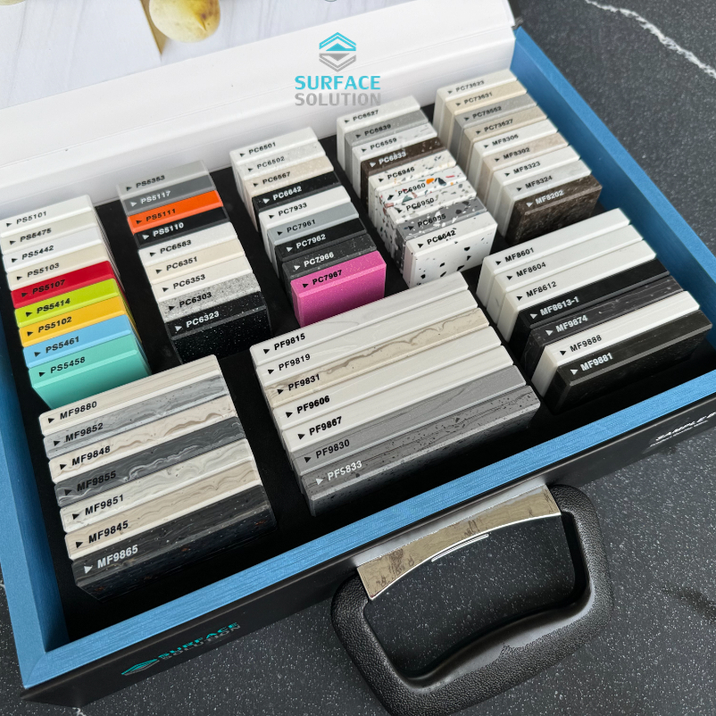
First, it’s essential to understand the key characteristics of acrylic solid surfaces that influence color pairing. Unlike natural stone (which often features veining, speckles, or irregularities), acrylic solid surfaces offer a smooth, consistent finish—though they come in a wide range of hues, from neutral whites and grays to bold blacks, blues, or even pastels. They also have a slight sheen that reflects light, adding warmth and depth to a space. When selecting wall colors, consider three core factors: the color of your acrylic surface, the light exposure of the room, and the mood you want to cultivate.

For neutral acrylic solid surfaces—such as white, off-white, light gray, or beige—you have unparalleled flexibility. These timeless surfaces act as a blank canvas, allowing you to lean into either calm minimalism or vibrant personality. If you’re aiming for a serene, cohesive look, opt for wall colors that are within the same color family but with subtle variations in tone. For example, a crisp white acrylic countertop pairs beautifully with soft ivory or warm cream walls. This creates a layered, airy feel without creating a stark, clinical vibe—perfect for kitchens, bathrooms, or bedrooms where tranquility is key. To add gentle depth, consider muted pastels like pale blue, sage green, or blush pink. These soft hues complement neutral surfaces without overwhelming them, infusing the space with a subtle pop of color that feels fresh and inviting.
If you want to create contrast with neutral acrylic surfaces, don’t shy away from deeper, richer wall colors—just ensure they don’t clash. A light gray acrylic backsplash, for instance, pairs stunningly with charcoal gray walls (for a monochromatic, sophisticated look) or even deep navy blue (for a touch of drama). For a warmer contrast, try terracotta, burnt orange, or warm taupe walls with a beige acrylic surface. These earthy tones complement the neutrality of the acrylic while adding warmth and character, making the space feel cozy and welcoming. In rooms with ample natural light, darker wall colors will still feel balanced against light acrylic surfaces; in dimmer spaces, stick to deeper neutrals (like taupe or soft gray) to avoid making the room feel cramped.
For bold or colored acrylic solid surfaces—such as black, navy, forest green, or even bold red—wall colors should take a more supportive role to avoid visual overload. The key here is to let the acrylic surface be the focal point while the walls frame it harmoniously. For dark acrylic surfaces (black, deep gray, or navy), light wall colors are your best bet. Crisp white walls create a striking, modern contrast that makes the dark surface stand out—ideal for contemporary kitchens or home offices. For a softer approach, try off-white, light beige, or pale gray walls. These hues soften the intensity of the dark acrylic while maintaining a clean, polished look. If you want to add a hint of color without competing, opt for very muted versions of complementary colors: for example, a pale sage green wall pairs beautifully with a forest green acrylic countertop, creating a cohesive, nature-inspired palette.
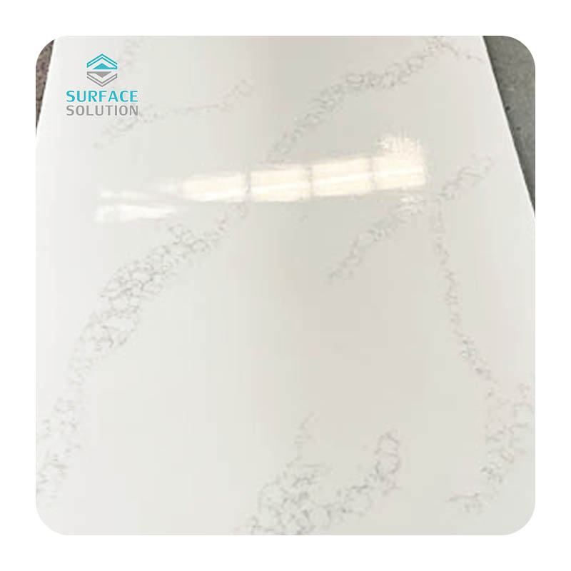
For bright or pastel acrylic surfaces—such as sky blue, soft yellow, or blush pink—wall colors should be neutral to keep the space feeling balanced. White or off-white walls are a safe, timeless choice that lets the colored acrylic shine without clashing. If you want to add a touch more warmth, try light gray or beige walls with warm undertones. Avoid pairing bright acrylic surfaces with equally bright wall colors (e.g., a lemon yellow acrylic with a coral wall) unless you’re going for an intentionally bold, eclectic look—this can quickly feel overwhelming in most residential spaces. Instead, let the acrylic be the star, and use walls to create a calm backdrop that enhances its vibrancy.
Lighting plays a pivotal role in how both your acrylic solid surface and wall color appear, so it's crucial to test colors before committing. Natural light changes throughout the day—morning light is cooler (bluer), while afternoon light is warmer (yellower)—so a wall color that looks perfect in the morning might feel off in the evening. Artificial lighting also matters: warm white bulbs (2700K-3000K) enhance earthy tones, while cool white bulbs (4000K+) bring out cooler hues like blue or gray. Test paint swatches on your walls and observe them at different times of the day, alongside your acrylic surface, to ensure the pairing works in all lighting conditions.
Another tip is to consider the room’s function. For high-traffic areas like kitchens or bathrooms, where acrylic surfaces are commonly used, wall colors should be both practical and aesthetically pleasing. In kitchens, warm neutrals (beige, taupe) or soft blues pair well with most acrylic countertops, creating a space that feels clean and inviting. In bathrooms, light, cool tones (pale blue, soft gray) complement acrylic vanities while enhancing the sense of freshness. For living rooms or bedrooms, where acrylic might be used for accent walls or furniture, you can be more playful—try deeper wall colors with neutral acrylic pieces, or neutral walls with bold acrylic accents to create a focal point.
Finally, don't forget about texture. While acrylic solid surfaces are smooth, wall textures (such as matte, eggshell, or satin finishes) can add dimension to the pairing. A matte wall finish, for example, creates a beautiful contrast with the slight sheen of acrylic, adding depth without overwhelming the space. Satin or eggshell finishes reflect a bit more light, which pairs well with neutral acrylic surfaces in rooms with less natural light.
Related Blogs
-
 When renovating kitchens, bathrooms or commercial spaces, homeowners and designers often weigh different countertop materials. Acrylic solid surface is one of the most popular options, but a common question remains: is it durable enough for everyday use?Acrylic solid surface countertops are manufact
 -
 Acrylic solid surface is a premium engineered composite material widely used for kitchen countertops, vanity tops, wall panels, custom furniture and commercial interior projects. Many people confuse it with pure acrylic sheet or natural marble, but it is a carefully formulated blend of mineral powde
 -
 Kitchens and bathrooms are the most frequently used and easily worn spaces in residential and commercial buildings, where countertops face constant spills, moisture, friction, and daily stains. Compared with traditional materials such as natural marble, granite, quartz stone, and laminate, acrylic s
 -
 In modern commercial architecture and interior design, selecting durable, hygienic, and aesthetically versatile materials is critical to balancing long-term functionality and visual appeal. Commercial grade acrylic solid surface has emerged as a top-tier choice for high-traffic business spaces, wide


