

Pairing Wall Colors with Your Acrylic Solid Surface Material


Warm-toned acrylics (e.g., cream, sand, soft beige, warm gray with yellow or red undertones) exude coziness and pair best with wall colors that enhance their warmth without overwhelming them. Think soft terracottas, muted golds, or warm off-whites. Avoid cool blues or grays, which can create a jarring contrast.
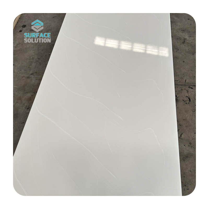
Cool-toned acrylics (e.g., icy white, steel gray, pale blue, or gray with blue or green undertones) convey modernity and calm. They thrive with wall colors that amplify their crispness, such as soft sage green, light sky blue, or cool off-whites. Steer clear of warm oranges or yellows, which can clash and make the space feel unbalanced.
Neutral acrylics (e.g., pure white, charcoal gray, or taupe with minimal undertones) are the most versatile, acting as a blank canvas for wall colors. Here, you can experiment with both warm and cool hues, depending on the mood you want to create. For example, a pure white acrylic countertop can pair with soft blush pink walls for a romantic vibe or navy blue walls for a bold, contemporary look.
Undertones are equally important. A “warm gray” acrylic might have subtle yellow undertones, while another “warm gray” could lean toward red. To identify undertones, place the acrylic surface next to a pure white object in natural light—you’ll notice hints of yellow, red, blue, or green. Wall colors should either complement these undertones (e.g., yellow-undertone acrylic with soft yellow walls) or create a subtle contrast (e.g., blue-undertone acrylic with pale green walls) to avoid a “muddy” appearance.

For warm-toned acrylic countertops (e.g., sand, cream, or warm taupe): Opt for soft, earthy wall colors like muted terracotta (#E2C0B3), warm beige (#F5E7D3), or light olive green (#D4E2C0). These hues complement the acrylic’s warmth while adding depth. Avoid bright whites, which can make the space feel sterile, or dark browns, which may create a heavy, dated look.
For cool-toned acrylic countertops (e.g., icy white, steel gray, or pale blue): Choose wall colors that amplify the kitchen’s modernity, such as soft sky blue (#C0D9E2), light gray (#E2E2E2), or pale sage green (#B3D4C0). These colors keep the space bright and airy, while the cool acrylic adds a sleek, clean finish. For a bold twist, pair a cool gray acrylic countertop with navy blue walls (#2C3E50)—the contrast creates visual interest without overwhelming the room.
Pro Tip: Use backsplashes to bridge the gap between acrylic surfaces and walls. A white subway tile backsplash, for example, can soften the contrast between a dark gray acrylic countertop and navy walls, creating a cohesive look.
For warm-toned acrylic vanities (e.g., soft beige, warm white with yellow undertones): Pair with wall colors that enhance tranquility, such as pale pink (#F5D7E2), light peach (#F5E2D7), or warm off-white (#F5F0E2). These hues create a soft, inviting atmosphere, perfect for a spa-like feel. Avoid dark colors, which can make small bathrooms feel cramped.
For cool-toned acrylic vanities (e.g., pure white, cool gray, or pale blue): Opt for wall colors that promote calm, such as light aqua (#D7F5E2), soft lavender (#E2D7F5), or cool white (#E2F0F5). These colors pair beautifully with cool acrylics, creating a fresh, modern look. For a touch of luxury, pair a white acrylic shower wall with light gray walls (#E2E2E2) and chrome fixtures—this combination feels sleek and timeless.
Pro Tip: Consider lighting. Bathrooms with limited natural light should avoid cool, dark wall colors, as they can make the space feel dim. Instead, choose warm off-whites or pale yellows to brighten the room, even with a cool-toned acrylic surface.
For warm-toned acrylic coffee tables (e.g., taupe, warm gray with red undertones): Pair with wall colors that create a cozy ambiance, such as soft mustard yellow (#F5E299), light brown (#D4B399), or warm cream (#F5F0E2). These hues make the space feel inviting, while the acrylic adds a touch of sophistication. For a layered look, add throw pillows or rugs in complementary colors (e.g., terracotta or olive green) to tie the design together.
For cool-toned acrylic accent walls (e.g., dark gray, navy blue, or pale green): Use wall colors that balance the acrylic’s boldness. If the acrylic is a dark cool gray, pair it with light gray walls (#E2E2E2) to create depth without making the room feel small. If the acrylic is a pale green, opt for soft white walls (#F5F5F5) to let the acrylic be the focal point.
Pro Tip: Incorporate texture to avoid a flat look. For example, a cool gray acrylic coffee table paired with light gray walls can be enhanced with a woven wool rug or a textured linen sofa, adding warmth and dimension.


Pure White Acrylic + Soft Sage Green Walls: This combination is perfect for kitchens or bathrooms, offering a fresh, organic look. The white acrylic keeps the space bright and clean, while the soft sage green adds a touch of nature, creating a calming atmosphere.
Warm Taupe Acrylic + Muted Terracotta Walls: Ideal for living rooms or bedrooms, this pairing exudes warmth and coziness. The warm taupe acrylic (often used for coffee tables or vanities) complements the muted terracotta walls, creating a rich, earthy vibe that feels both modern and rustic.
Cool Gray Acrylic + Navy Blue Walls: A bold, contemporary choice for kitchens or home offices, this combination creates strong contrast without clashing. The cool gray acrylic (e.g., countertops or desk surfaces) balances the deep navy walls, resulting in a sleek, sophisticated space.
Pale Blue Acrylic + Light Gray Walls: Perfect for bathrooms or bedrooms, this pairing is soft and serene. The pale blue acrylic (e.g., shower walls or accent shelves) adds a subtle pop of color, while the light gray walls keep the space calm and versatile.
Ignoring Lighting: Natural and artificial light can drastically change how wall colors and acrylic surfaces look. Always test paint samples in the room at different times of day—what looks like a soft beige in the morning might appear yellow in the evening. For rooms with warm overhead lighting, avoid cool wall colors, as they can look dull. For rooms with cool LED lighting, steer clear of warm wall colors, which may appear orange.
Overcomplicating the Palette: Too many colors can make a space feel chaotic. Stick to a maximum of three main colors: the acrylic surface, the wall color, and one accent color (e.g., a rug, pillow, or artwork). For example, if your acrylic is warm taupe and your walls are muted terracotta, add an accent color like olive green to tie the look together without overwhelming the space.
Matching Undertones Too Closely: While complementary undertones are key, matching them too closely can create a “flat” look. For example, a warm gray acrylic with yellow undertones paired with bright yellow walls may feel monotonous. Instead, opt for a softer yellow (e.g., buttery yellow) or a complementary hue (e.g., soft orange) to add depth.
Related Blogs
-
 How to Pair Fixtures with Bathroom Sink Furniture: A Guide to Acrylic Artificial StoneThe bathroom is no longer just a functional space—it’s a sanctuary where aesthetics and practicality converge. When designing or renovating this intimate area, the pairing of fixtures with bathroom sink furniture p
 -
 Bathroom Sink Furniture: A Timeless Addition to Your HomeThe bathroom is more than just a functional space in a home; it is a private retreat where we start and end each day, a corner that blends practicality with comfort and aesthetic charm. When designing or upgrading a bathroom, choosing the righ
 -
 Comparing Bathroom Sink Furniture and Wall-Mounted Sinks: The Advantages of Acrylic Artificial StoneThe bathroom is more than just a functional space—it is a sanctuary where functionality meets style, and every fixture plays a pivotal role in shaping its comfort, aesthetics, and practicality. When i
 -
 Choosing the perfect countertop material requires careful consideration of both style along with functionality. Homeowners, architects, as well as interior designers frequently seek materials offering durability, seamless integration, plus aesthetic versatility. Solid surface countertops consistentl


